Merchva
An online shop for thousands of illustrated designs on everyday products: stickers, tees, mugs, wall art and more.
- Role
- UX/UI designer
- Developer
- Brand designer
- Timeline
- 6 months
- Deliverables
- Branding/Logo
- Responsive storefront
- Medusa backend
- Live site
- merchva.com
Art for niches the algorithm never finds.
Merchva sells thousands of illustrated designs on everyday products: stickers, tees, hoodies, mugs, wall art and more! Merchva is built for niches only you would recognize, with a playful, slightly wry voice and quality people can trust. It needed a brand, a storefront that puts the art first, and a front end fast enough to keep it that way.
Three things had to work.
A standout brand
Stand out in a crowded print-on-demand market.Easy discovery
Help people find the right design among 1,200+ niches.Trust in quality
Prove the quality before anyone holds the product.Three steps to shopping by interest.
Review
How other stores sort- Looked at established merch and print-on-demand stores.
- Nearly all sort by product type.
Find the motive
People buy for who they arex3 personas, gift buyers, fans and collectors - each start from an interest.
Lead with the topic
Topic ahead of productLet shoppers browse by what they care about.
Let the art bring the color.
A clean light-gray base keeps every design front and center. A ten-color spectrum, from blue through magenta and coral to green, appears only where the brand speaks. Navigation starts with eleven topics, from Pets and Plants to Music and Games & Geek, beside nine product types. The tone stays playful and a little wry, down to the microcopy.
Logo

A lowercase wordmark, rounded and bold to match the playful, slightly wry voice. One flat shape, built to sit on any colour and let the art lead.
Home page
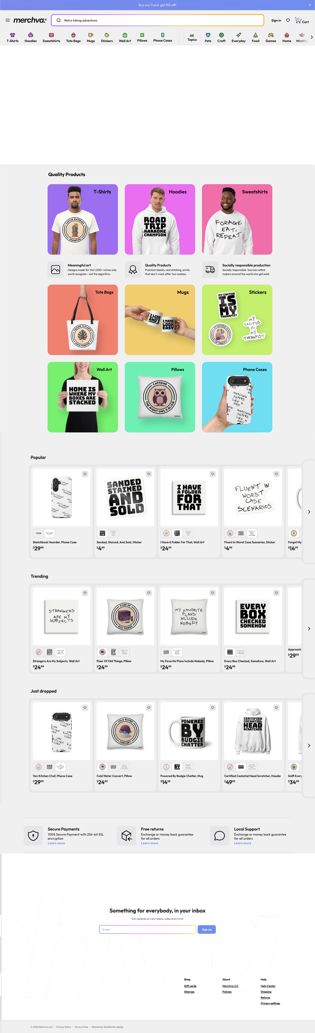
Living search
A rainbow stroke circles the field while the placeholder types out ideas.
Moving hero
Product lozenges drift past in opposite directions, showing popular products automatically.
Values up front
Meaningful art, quality and responsible production.
Swatches
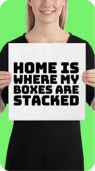
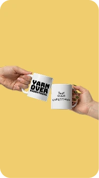
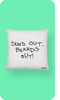
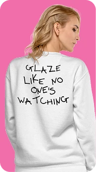
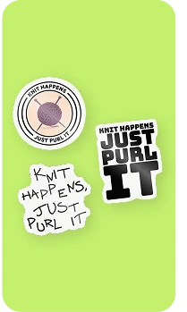
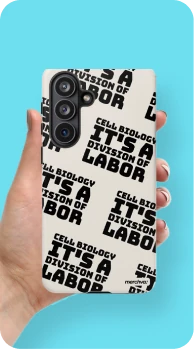
Small thumbnails show the same design on other products.
Moving footer
A giant wordmark drifts behind the signup as you reach the end.





Product and topic
Product types and topics sit side by side.
Art on color
Colors follow sales. The more a product or topic sells, the more popular it ranks, and the icons across the top are shown in popularity order. Each rank gets its own rainbow color, so the spectrum always runs in order and updates as sales change.
Shelves
Popular, Trending and Just dropped keep new designs in front of people.
Trust built in
Secure payments, free returns and real support, stated plainly.
Living search
A rainbow stroke circles the field while the placeholder types out ideas.
Product and topic
Product types and topics sit side by side.
Moving hero
Product lozenges drift past in opposite directions, showing popular products automatically.
Art on color
Colors follow sales. The more a product or topic sells, the more popular it ranks, and the icons across the top are shown in popularity order. Each rank gets its own rainbow color, so the spectrum always runs in order and updates as sales change.
Values up front
Meaningful art, quality and responsible production.
Shelves
Popular, Trending and Just dropped keep new designs in front of people.
Swatches
Small thumbnails show the same design on other products.
Trust built in
Secure payments, free returns and real support, stated plainly.
Moving footer
A giant wordmark drifts behind the signup as you reach the end.
Store page
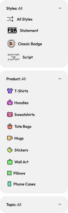
Filters that stay put
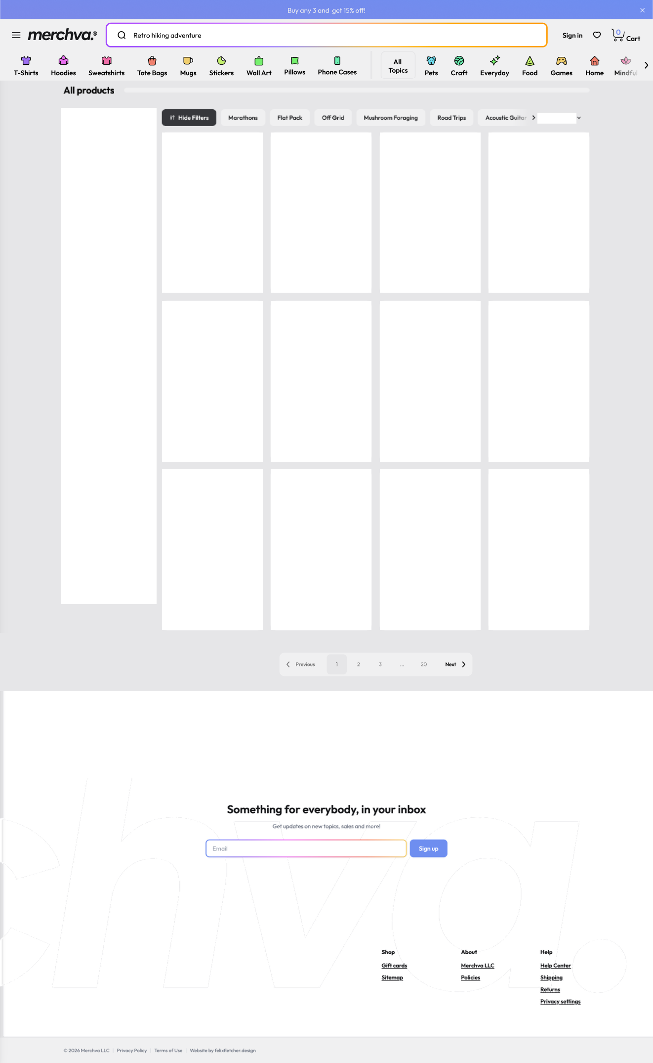
Style, product and topic filters sit beside the grid, so you never lose your place.









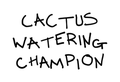

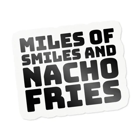
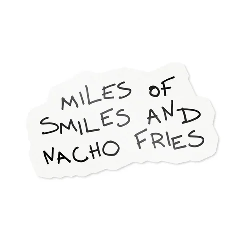



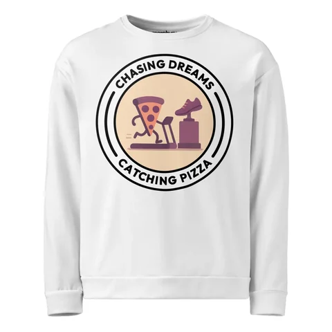
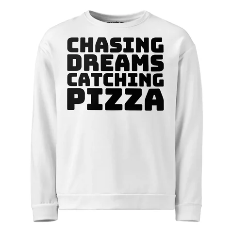
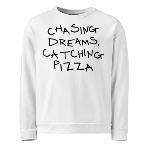


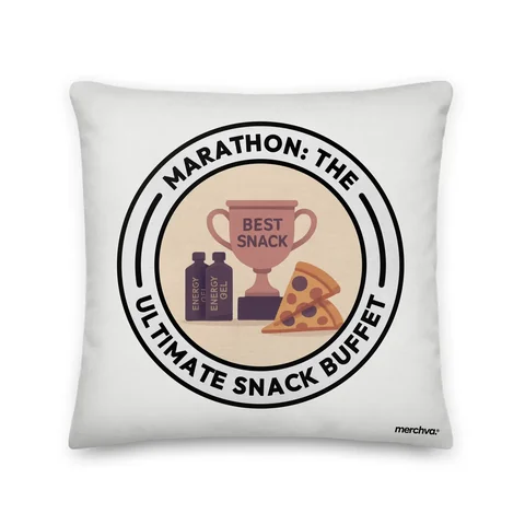
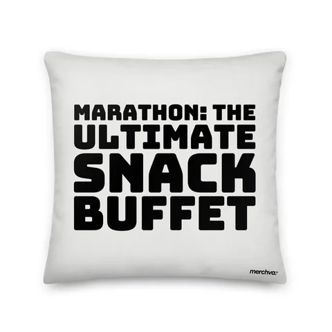
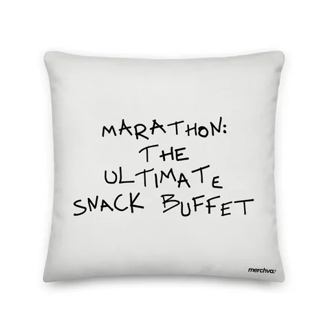


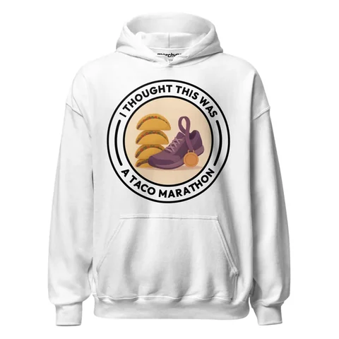
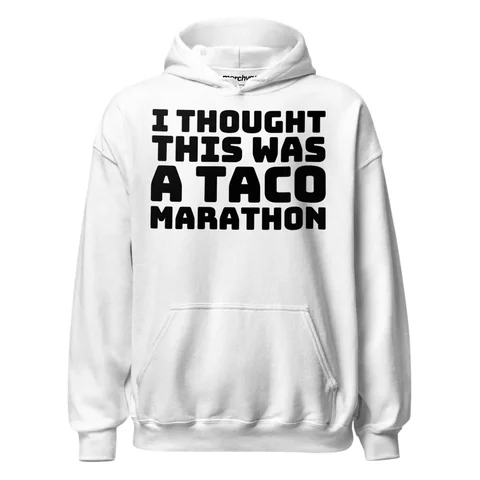
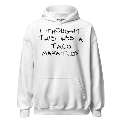



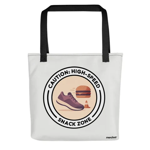
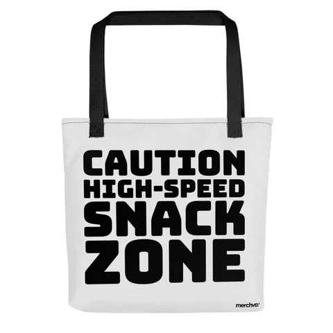






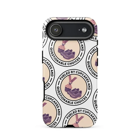
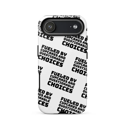
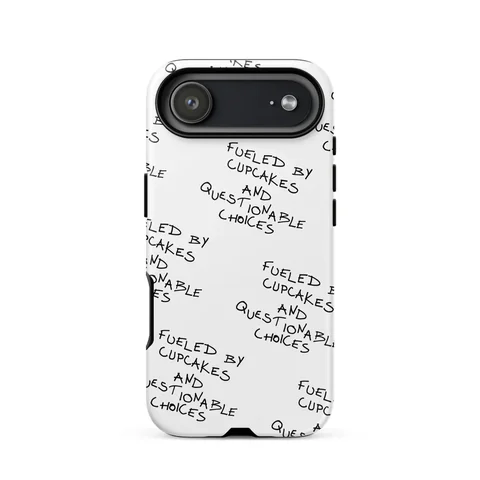


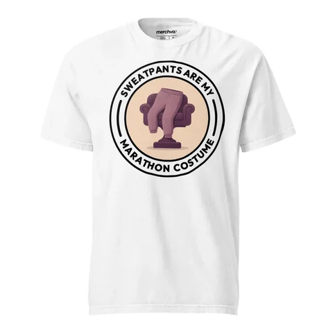

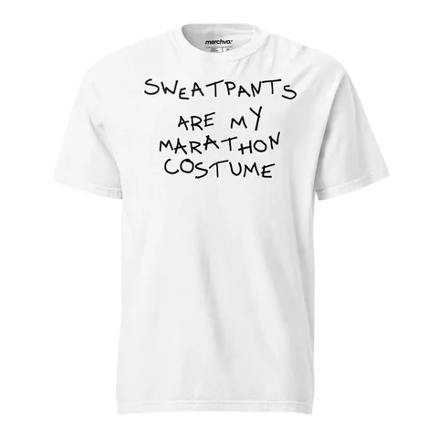



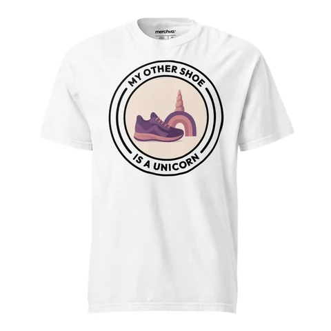
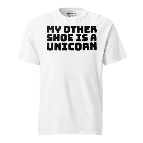
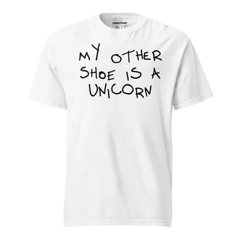

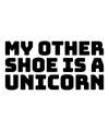
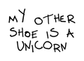

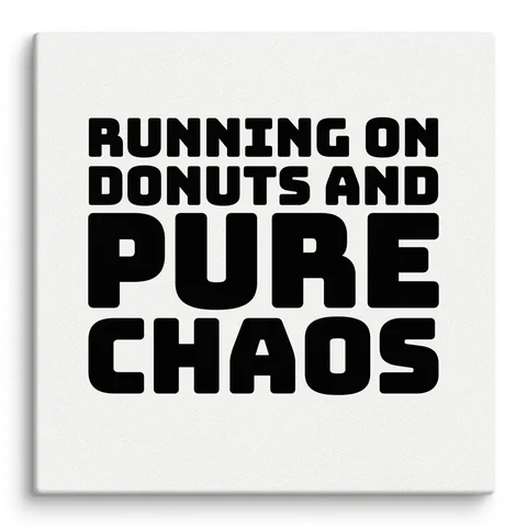


Quick topic chips
Niche shortcuts and sorting sit right above the products.
Designs and options
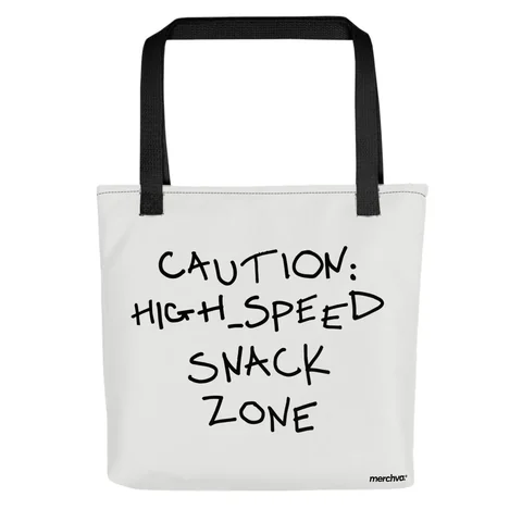
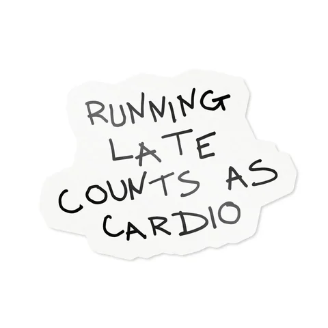
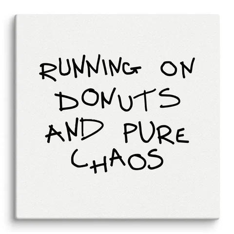
Each card shows the design on its product, with thumbnails for the other options.
Quick topic chips
Niche shortcuts and sorting sit right above the products.
Filters that stay put
Style, product and topic filters sit beside the grid, so you never lose your place.
Designs and options
Each card shows the design on its product, with thumbnails for the other options.
Product page
Clear gallery
A large product view with thumbnails beside it keeps the artwork in focus.
Details on demand
Highlights up front, with the long description folded away.
Recently viewed
Recently viewed items and recommendations keep people moving.
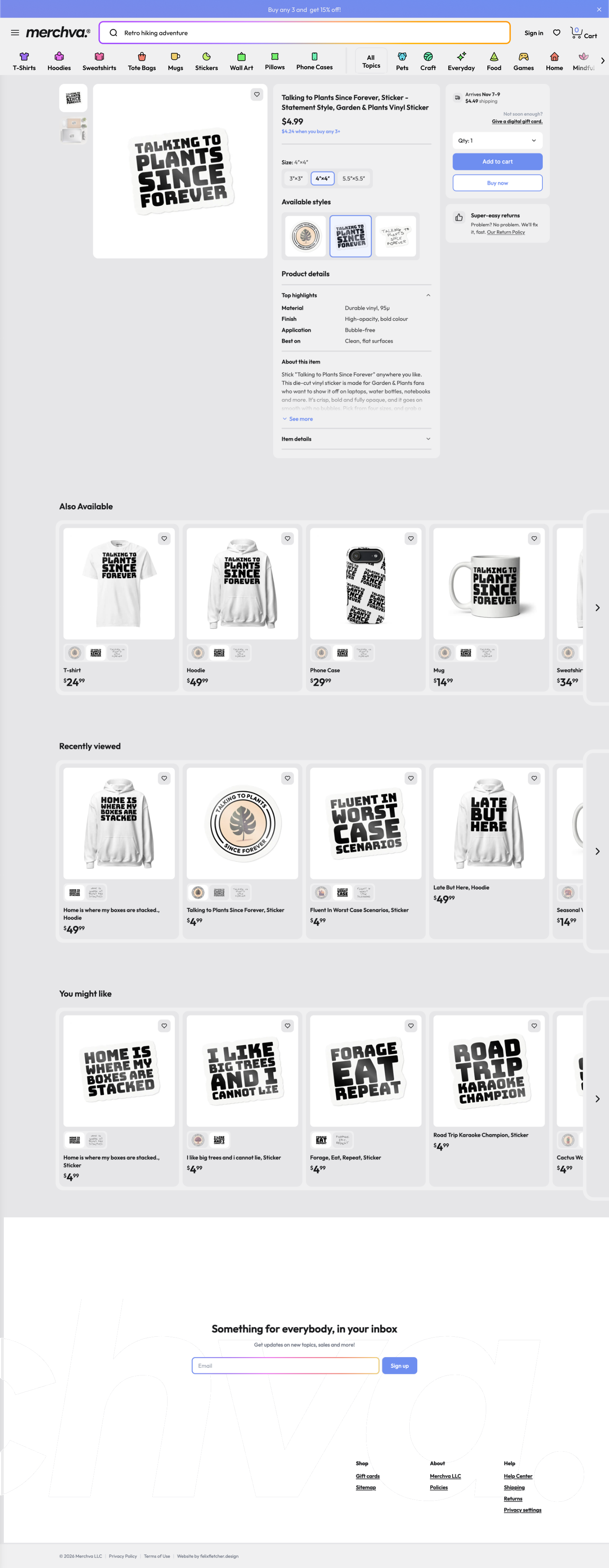
Buy box
Price, size and quantity sit together, with one clear Add to cart.
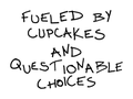
Available styles
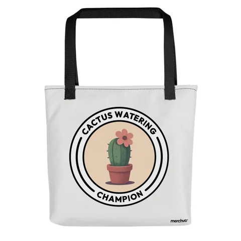
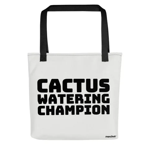
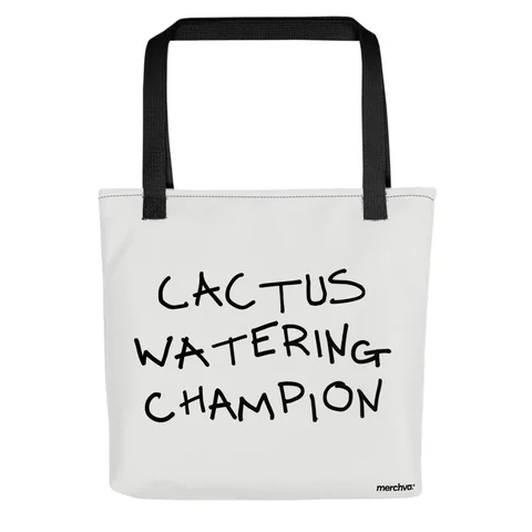
Statement, badge or script: the same choice as the store filter.
Also available
The same design on other products, each with its own artwork options.
Moving footer
The giant wordmark slides across behind the signup as you reach the end.
Buy box
Price, size and quantity sit together, with one clear Add to cart.
Clear gallery
A large product view with thumbnails beside it keeps the artwork in focus.
Available styles
Statement, badge or script: the same choice as the store filter.
Details on demand
Highlights up front, with the long description folded away.
Also available
The same design on other products, each with its own artwork options.
Recently viewed
Recently viewed items and recommendations keep people moving.
Moving footer
The giant wordmark slides across behind the signup as you reach the end.
Buying flow
From product to placed order in a few calm steps. A cart drawer confirms every add, the cart tracks the 15% bundle offer, and checkout opens one step at a time so it never feels like a wall of forms.
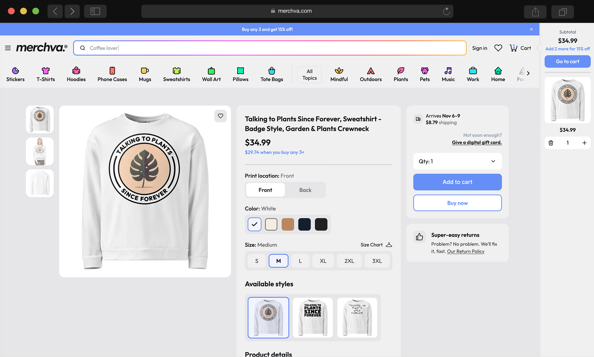
Cart drawer
Add to cart opens a drawer instead of leaving the page.
- Subtotal and shipping shown at once
- Nudges a second item toward the 15% bundle offer
- Go to cart or keep browsing
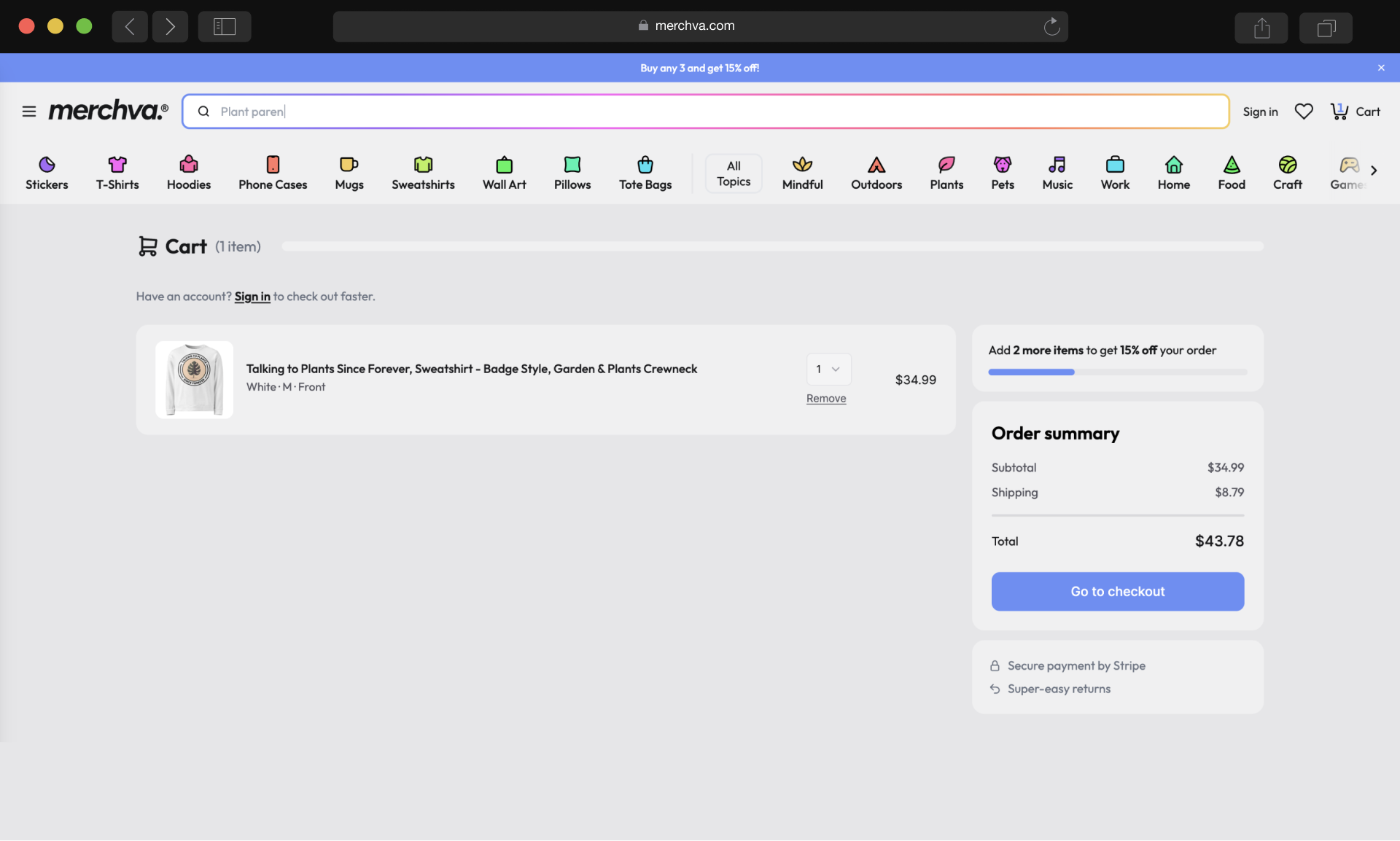
Cart
The whole order on one calm screen.
- Subtotal, shipping and total
- Progress bar toward the 15% bundle discount
- Secure payment and easy returns noted
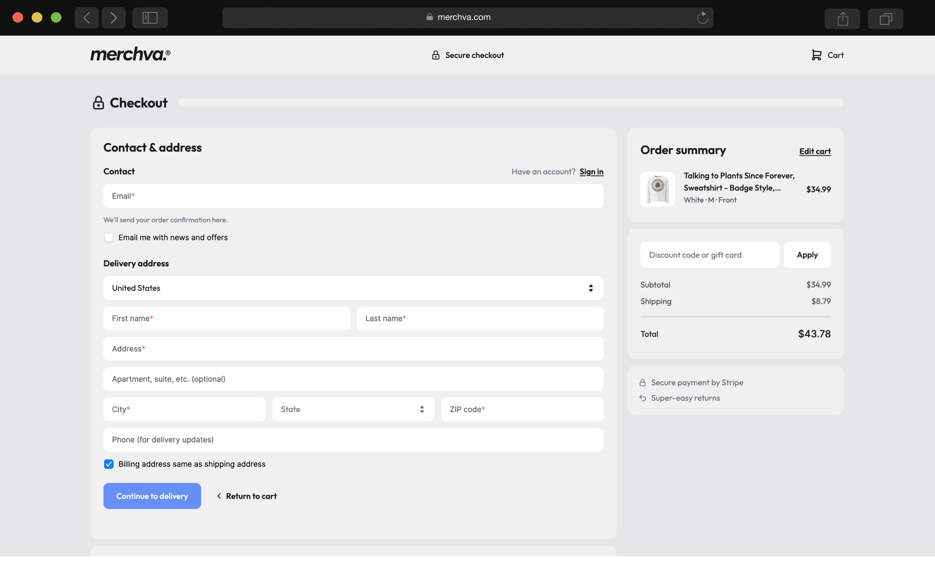
Contact and address
Step one opens alone, so the form never feels long.
- Email and delivery address in one card
- Billing defaults to the shipping address
- Order summary stays in view
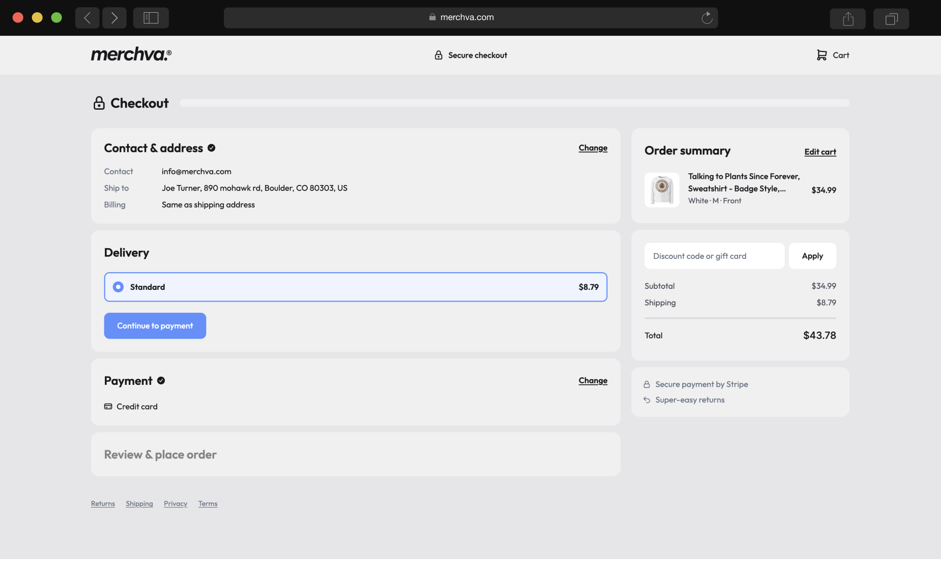
Delivery
Finished steps collapse to a one-line summary.
- Contact and address kept, with a Change link
- Pick a shipping method
- Next step unlocks when this one is done
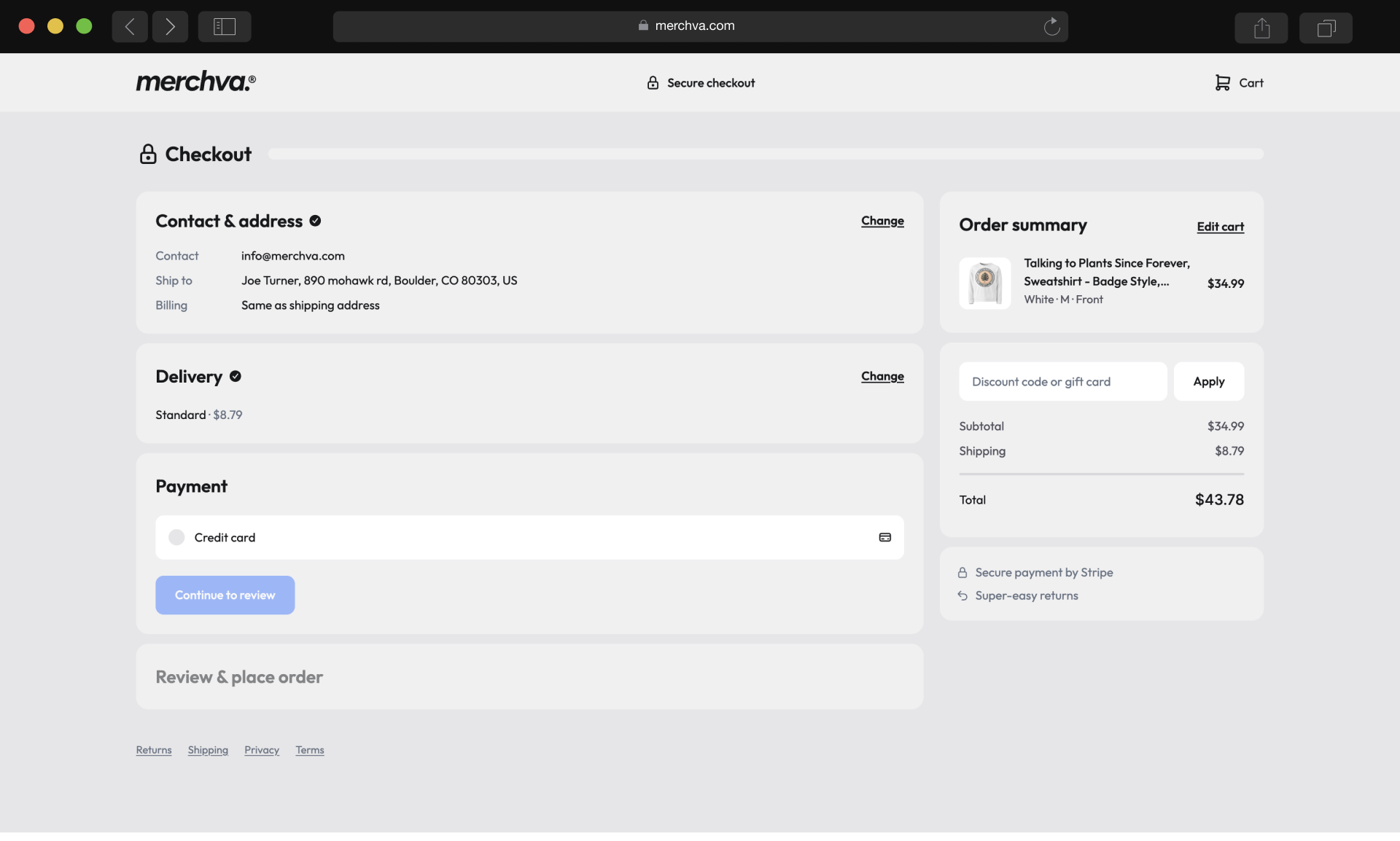
Payment
Payment waits until delivery is confirmed.
- Credit card is the one option
- Next step stays disabled until it is chosen
- Delivery can still be edited above
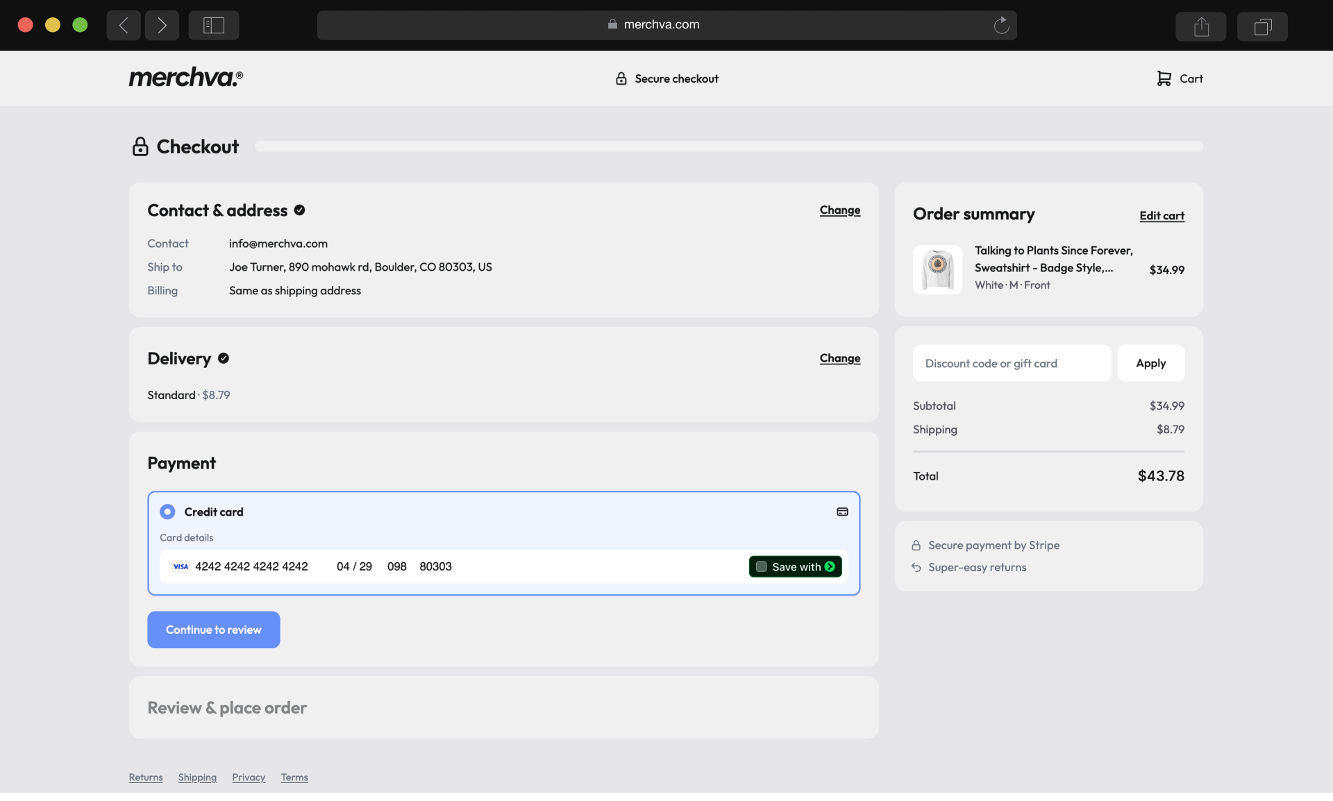
Card details
Card fields appear only when needed.
- Number, expiry, CVC and ZIP on one row
- Option to save the card
- Chosen method clearly highlighted
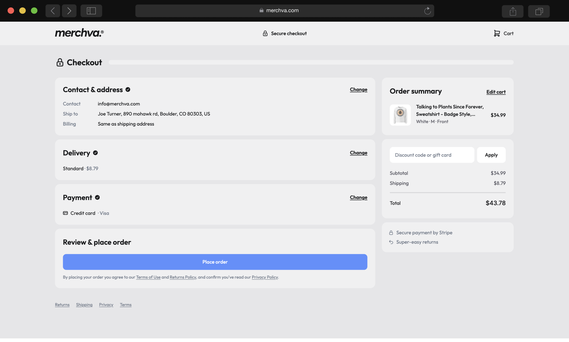
Review and place order
Every choice is summarized before the final tap.
- Contact, delivery and payment listed
- One clear Place order button
- Terms and returns linked below
Merchva is live as a complete store: 1,200+ niches, nine product types and eleven topics, with a lively home page that puts the artwork first.
I designed and built it alone in six months. It works from phone to desktop, and the live site matches the Figma file.