Earths Embrace
Logo, brand and website for an earth-first landscaper in Boulder County.
- Role
- Brand designer
- UX/UI designer
- Developer
- Timeline
- 1.5 Months
- Deliverables
- Branding/Logo
- Coded website
- Live site
- earthsembrace.co
Landscaping that treats the land as sacred.
Earths Embrace designs, plants and cares for gardens across Boulder County, and teaches people to look after their own. The work is practical and spiritual at once. They needed a logo, brand and website that feel calm and grounded, yet still professional.
Three challenges.
A mark with meaning
Sun, plant and earth in one simple shape.Calm, not crunchy
Spiritual, yet still trusted.Made to be found
Gardens first, booking easy.Four stages from brand to website.
Discover
Listen before designing- Interview the founder.
- Define audience, values and tone.
Explore
Research and sketchStudy competitors, build a moodboard, sketch logo ideas.
Design
Shape the logo and pages- Develop the best logo concepts.
- Design UX/UI.
Build
Bring it all togetherVibe code the responsive website.
Quiet, natural and grounded.
Contour lines and the Golden Ratio echo the logo, sage and deep green keep it calm, and real landscaping photos do the selling.
Logo

Hands held in prayer. A rising sun above a plant. A spiral that follows the Golden Ratio, in one rounded arch: practical and spiritual at once. Boho.
Home page
Golden ratio
A spiral echoes the logo and guides the eye.
Philosophy
One sentence of company core beliefs, with a link to services.
Founder note
A quote and portrait add a human touch.

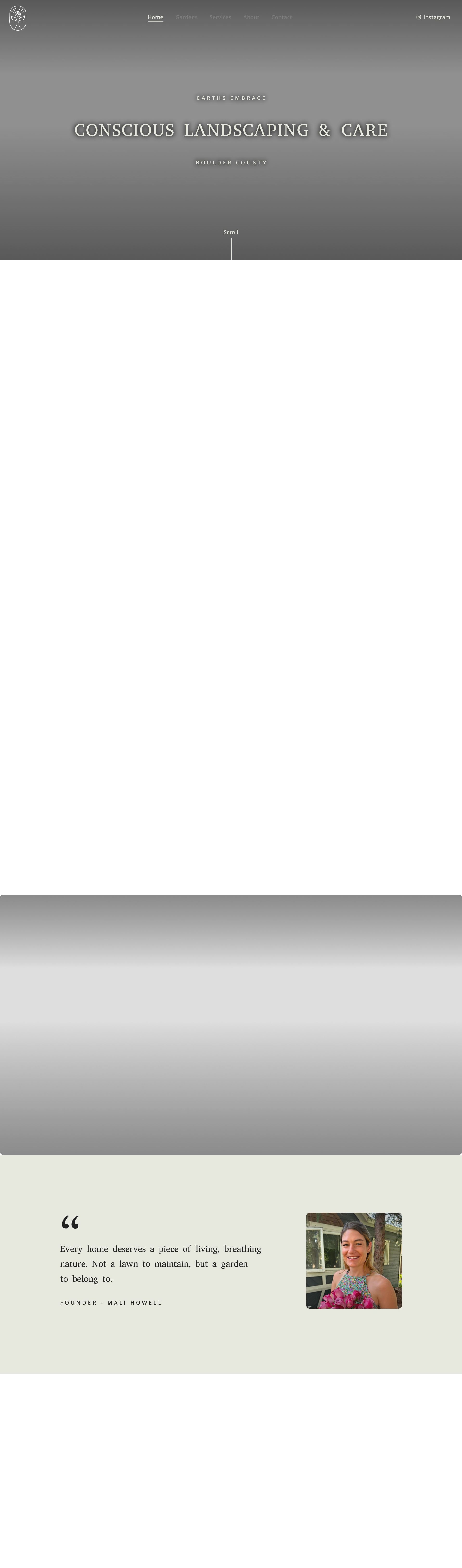
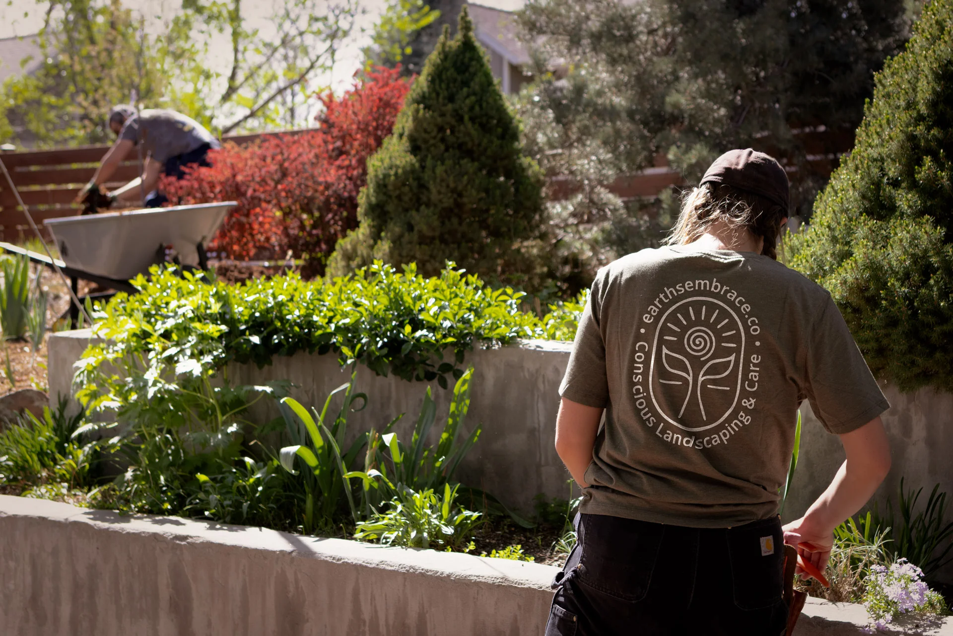











Full-bleed hero
Real garden work and a short promise.
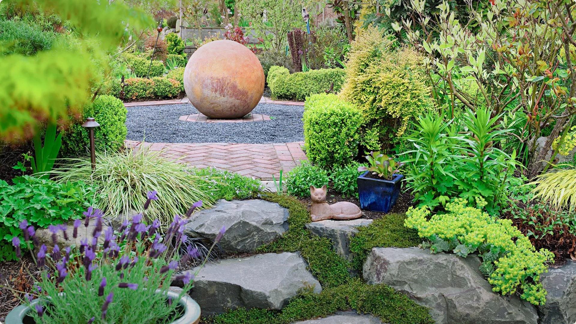
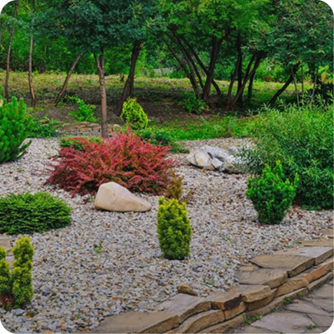
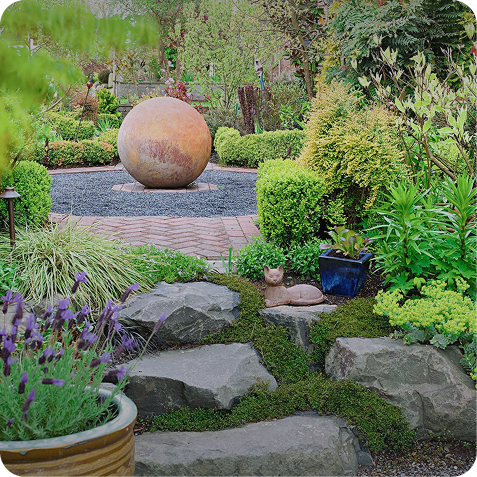
Garden collage
Overlapping photos show the range of work.
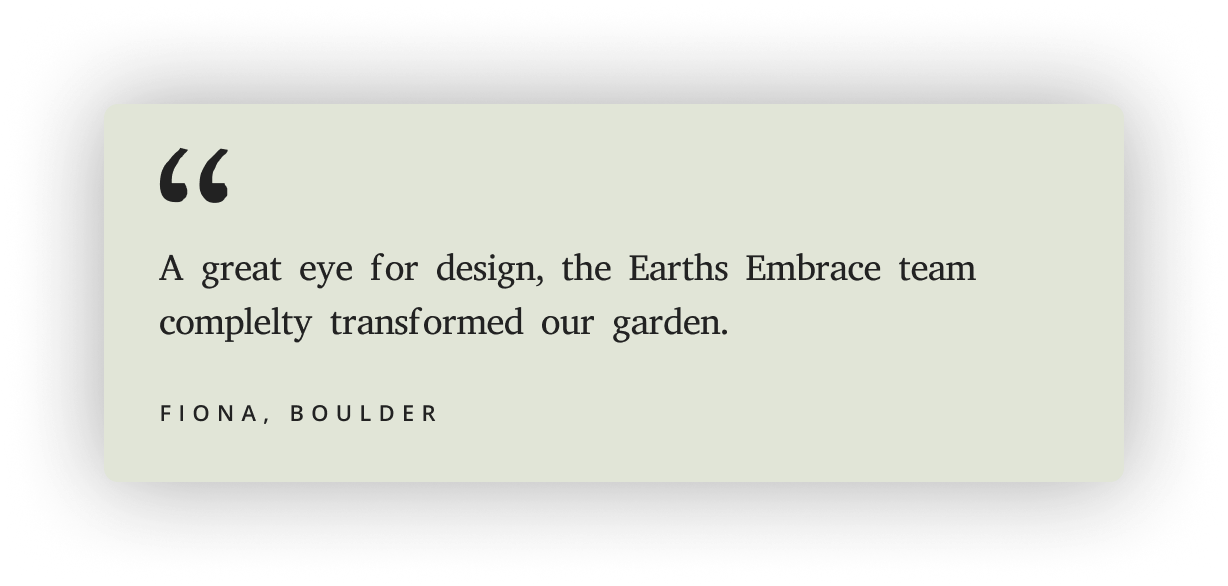
Client voices
Happy client reviews.
Clear next step
Every page ends with an invitation to talk.
Full-bleed hero
Real garden work and a short promise.
Golden ratio
A spiral echoes the logo and guides the eye.
Garden collage
Overlapping photos show the range of work.
Philosophy
One sentence of company core beliefs, with a link to services.
Client voices
Happy client reviews.
Founder note
A quote and portrait add a human touch.
Clear next step
Every page ends with an invitation to talk.
Inner pages
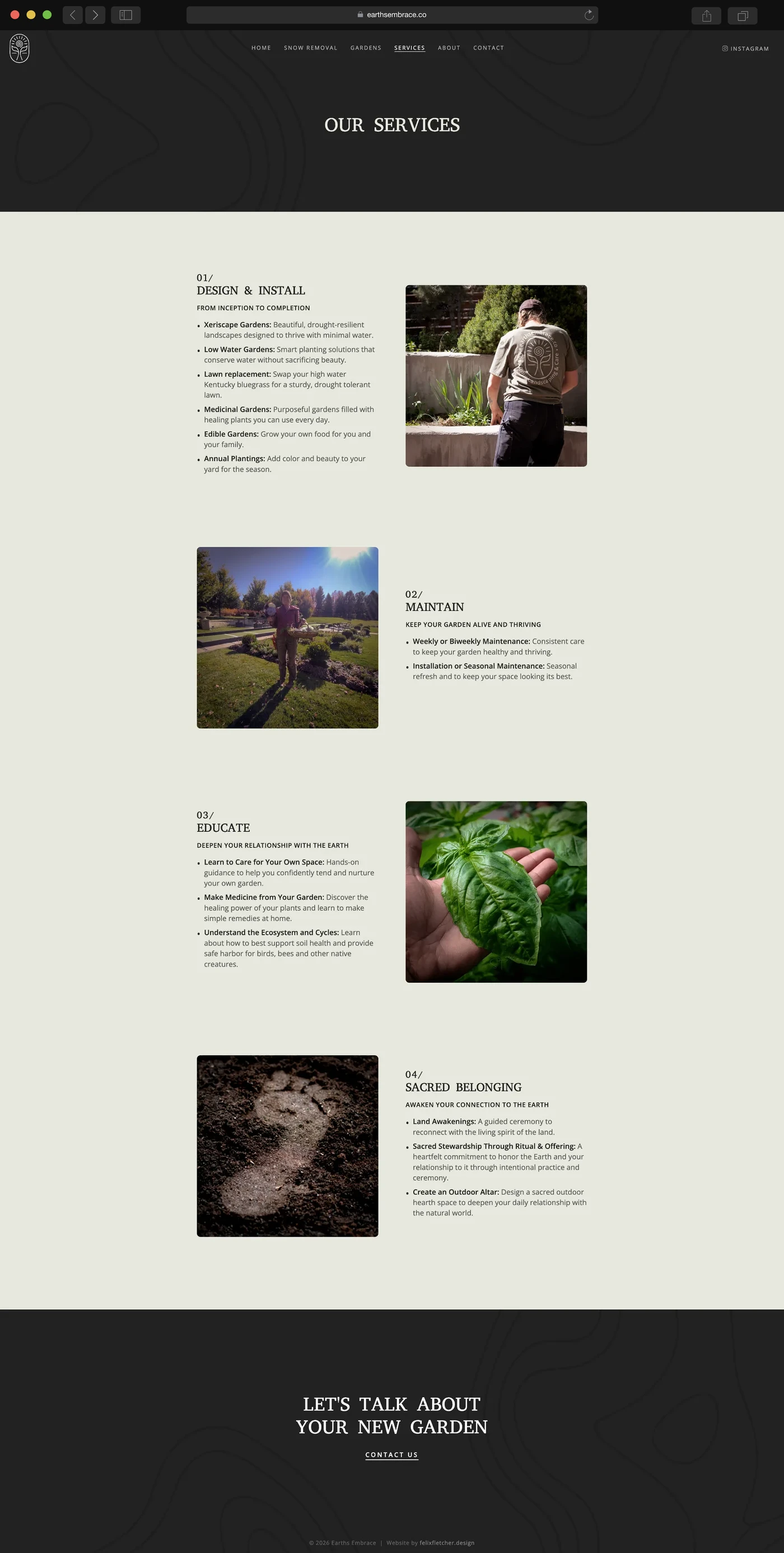
Services
Everything on offer.
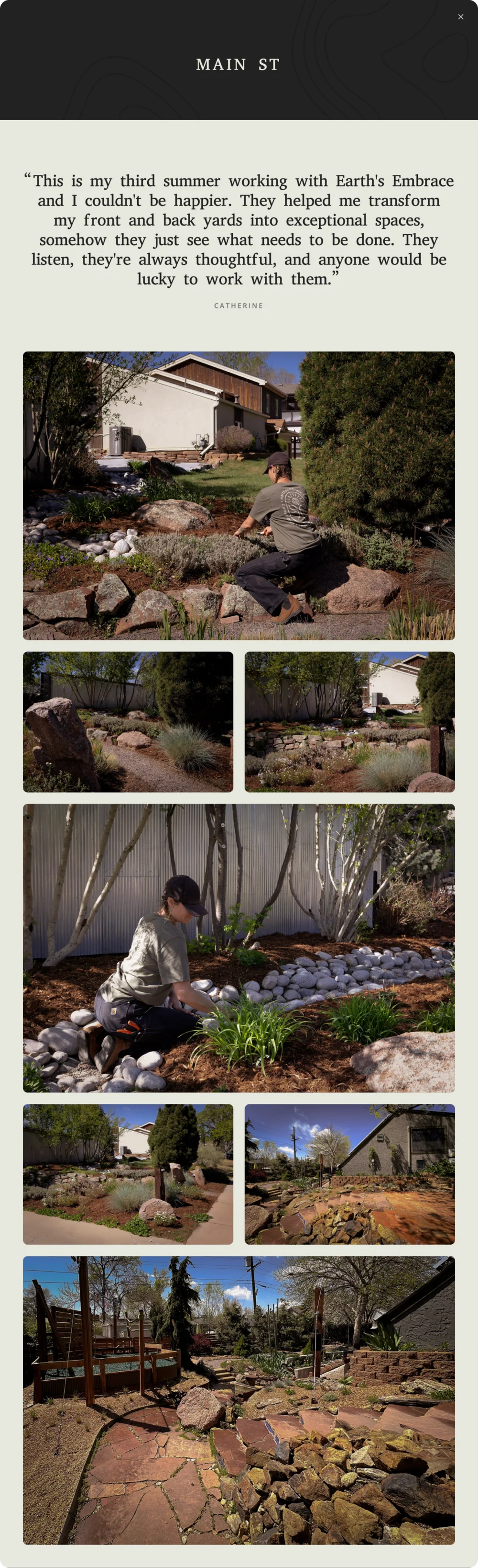
Popup
Opens as a pop-up from Our Gardens with a client quote and a photo grid.

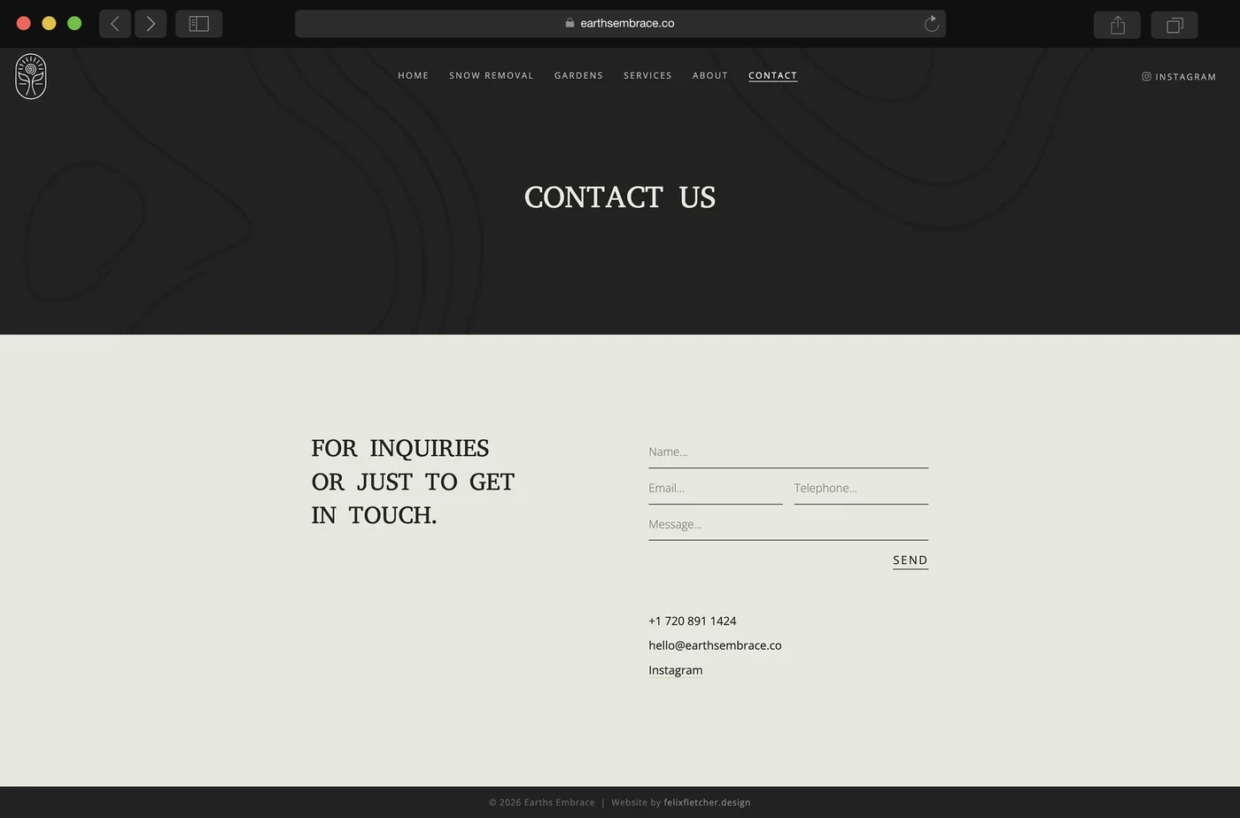
Contact
The ideal destination for all users of this website.
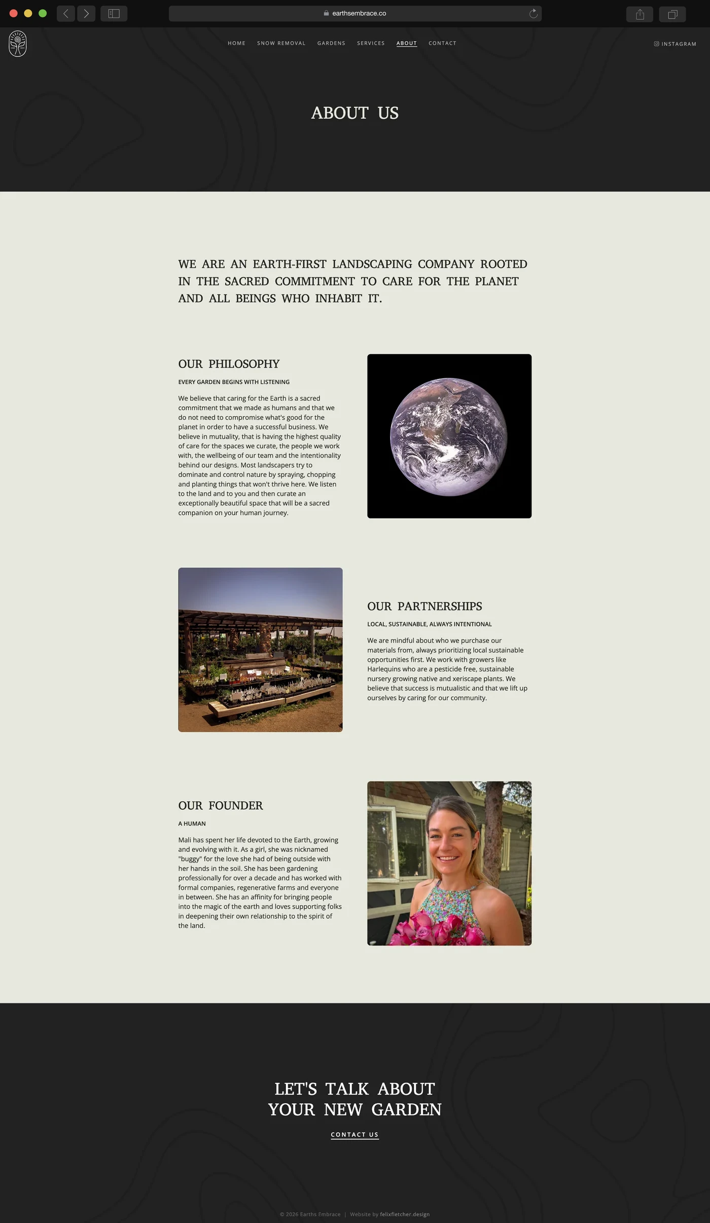
About
Company beliefs and the founder's story in one scroll.
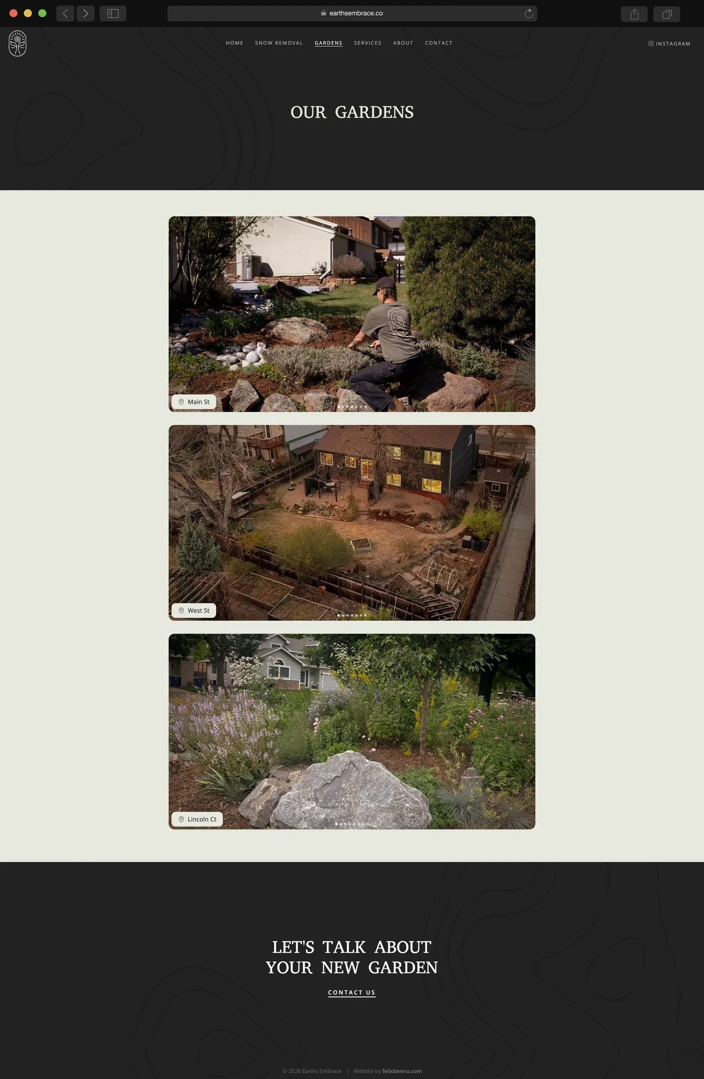
Gardens
Project galleries
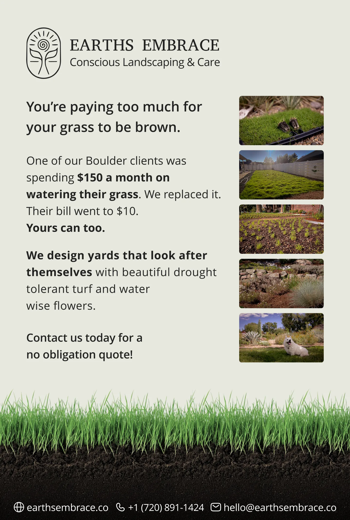
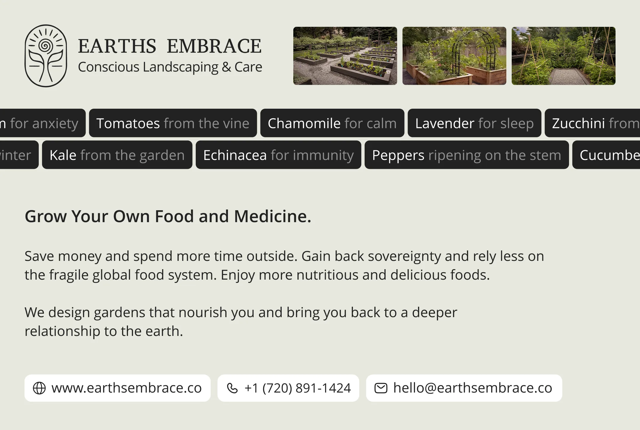
Postcards and rack cards sent out at the start of the landscaping season to get the schedule fully booked.
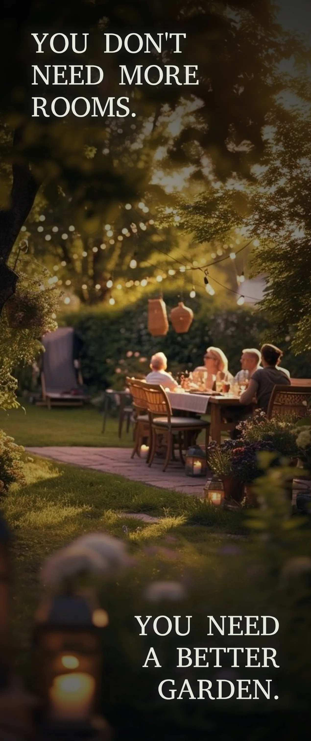
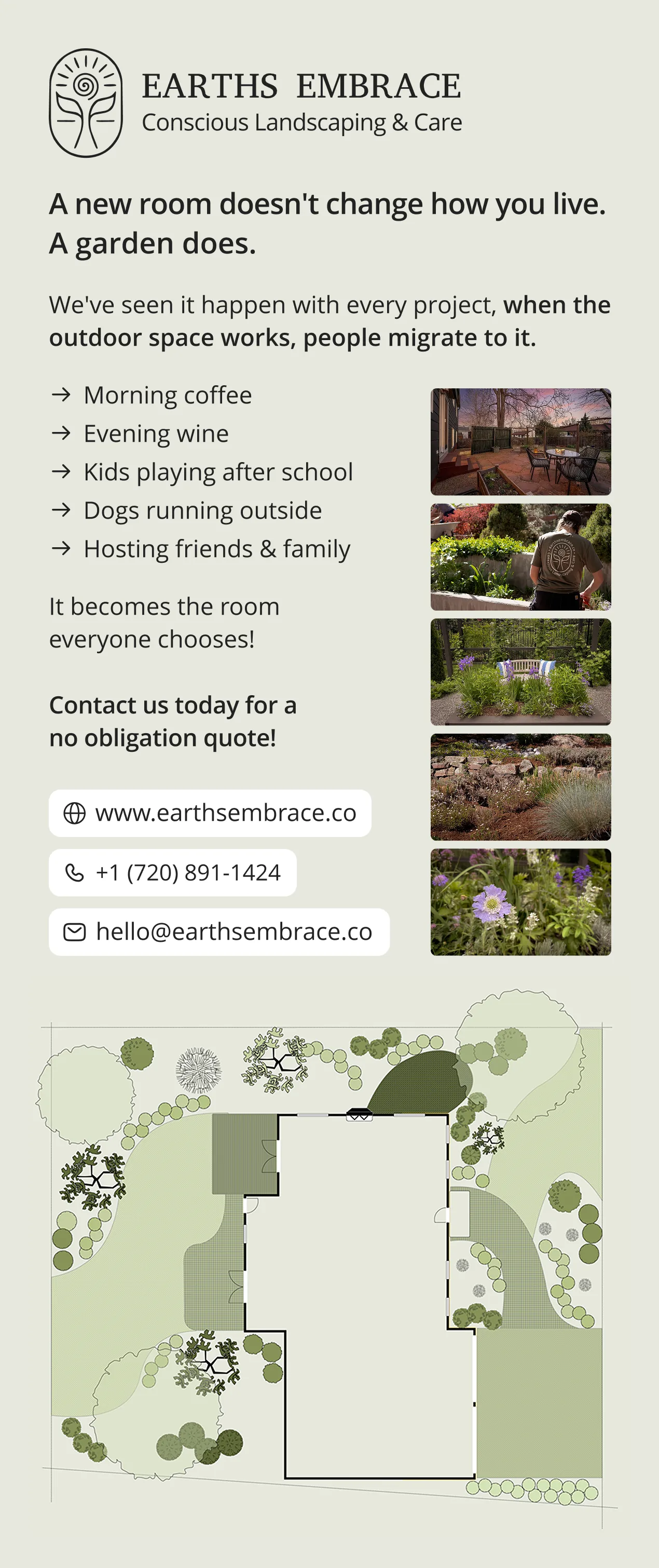
Earths Embrace launched with a clear logo and a matching website, built to feel as calm and grounded as the gardens themselves.
The brand works across screen, t-shirts, trucks and print. Potential clients can see the gardens and book a consultation in a couple of clicks.